Learning how to set default font in word saves time when you create documents regularly. Instead of changing font, size, spacing, and style every time, you can set your preferred look once and use it across new files.
Microsoft Word is widely used for letters, reports, assignments, business documents, proposals, and professional content. A consistent default font helps your documents look cleaner, more polished, and easier to read from the first line.
This guide explains the process in a simple way for Windows, Mac, templates, styles, and troubleshooting. You will also learn how default fonts work, why changes may not save, and how to keep formatting consistent.
Default Fonts in Word
A default font is the font Word automatically uses when you open a new blank document. It usually includes the font family, size, style, colour, and sometimes related formatting attached to the active template.
Word uses templates to control many default settings. The most common one is the Normal template, which affects new blank documents. When you change the default font correctly, Word applies it to future documents based on that template.
This is useful because it removes repetitive formatting work. If you prefer Aptos, Calibri, Times New Roman, Arial, Georgia, or another font, setting it as default makes every new document start with your chosen style.
Benefits of Setting a Default Font
A default font gives your documents a consistent appearance. This is important for students, office workers, writers, legal teams, and businesses that need a clear visual style across repeated documents and shared files.
It also improves productivity. You do not need to select all text, change the font manually, or adjust size each time. A few minutes of setup can save hours across many documents.
Default fonts can also support branding. If your website or business uses a specific typeface, matching your Word documents with that visual identity creates a more professional experience for readers and clients.
After understanding the basics, keep these points in mind before changing your default font:
- Choose a readable font for long documents.
- Use a size that suits your document type.
- Avoid decorative fonts for formal writing.
- Test the font in print and PDF format.
- Use the same font across related templates.
- Keep accessibility and readability in mind.
- Make sure the font is installed on your device.
Setting Default Font in Word on Windows
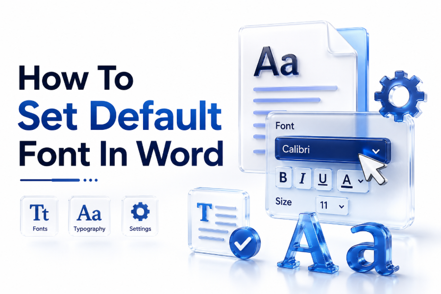
Open Microsoft Word and create a blank document. Go to the Home tab, then find the Font group. Click the small arrow in the bottom-right corner of the Font section to open the Font dialog box.
You can also press Ctrl + D to open the same dialog box quickly. Choose your preferred font, font style, size, colour, underline option, and effects if needed. Keep the settings simple for daily use.
After selecting your preferred settings, click Set As Default. Word will ask whether you want the change for the current document only or for all documents based on the Normal template. Choose the Normal template option.
Choosing the Right Font Settings
The best default font depends on your document purpose. For business writing, clean fonts such as Aptos, Arial, Calibri, or Times New Roman are safe choices. They are readable and commonly accepted.
Font size also matters. Many professional documents use 11 or 12 point text. Smaller text may look crowded, while larger text may feel informal or take too much space on the page.
Avoid using bold, italic, underline, or unusual colours as a default unless your document style requires them. A regular font style with a dark text colour is usually best for everyday documents.
Here is a simple font selection guide for common document types:
| Document Type | Suggested Font | Suggested Size |
| Business letter | Aptos or Arial | 11 or 12 |
| Academic paper | Times New Roman | 12 |
| CV or résumé | Aptos, Calibri, or Arial | 10.5 to 12 |
| Legal document | Times New Roman or Arial | 12 |
| Creative proposal | Georgia or Aptos | 11 or 12 |
| Internal report | Aptos or Calibri | 11 |
Setting Default Font in Word on Mac
Open Word on your Mac and start a blank document. Go to the Format menu and choose Font. You can also use the keyboard shortcut Command + D to open the Font dialog box faster.
Select the font, size, style, and other settings you want. Keep your choices practical, especially if the documents will be shared with people using Windows or different versions of Word.
Click Default after selecting your settings. Word may ask whether you want the change to apply to the current document or to all new documents based on the Normal template. Choose the wider option for future documents.
Using Styles for Better Font Control
Changing the default font is helpful, but styles give you deeper control. Styles manage normal text, headings, subheadings, quotes, captions, and other repeated formatting across your document.
The Normal style usually controls body text. If your font keeps changing unexpectedly, update the Normal style as well. This helps Word apply your chosen font more reliably throughout the document.
Styles are especially useful for long reports, articles, books, and business documents. They allow you to change formatting in one place instead of editing each heading or paragraph manually.
For better formatting control, use this simple style workflow:
- Open the Styles pane from the Home tab.
- Right-click the Normal style.
- Choose Modify.
- Select your preferred font and size.
- Choose whether to apply it to this document or new documents.
- Update Heading styles separately if needed.
- Save the template if you want permanent changes.
Changing Default Font for One Document Only
Sometimes you may not want to change Word’s global default font. You may only need a specific font for one proposal, assignment, client file, or report. Word allows this limited change easily.
Open the Font dialog box and select your font settings. When Word asks where to apply the default change, choose the current document only. This keeps your wider Word settings unchanged.
This option is useful when different clients or projects require different formatting. It helps you meet document requirements without affecting every new file you create in the future.
Changing Default Font for All New Documents
If you want every new blank document to use the same font, apply the change to all documents based on the Normal template. This is the most common choice for everyday Word users.
Once saved, your new blank documents should open with your selected font. Existing documents usually keep their original formatting unless you manually update them or apply styles again.
This setting is ideal for users who always prefer the same writing style. It creates a reliable starting point for letters, notes, contracts, reports, and other repeated document types.
Use this checklist after changing the default font:
- Close Word completely.
- Open Word again.
- Create a new blank document.
- Type a few lines of sample text.
- Check the font name and size.
- Save a test document.
- Reopen it to confirm the setting remains.
Fixing Default Font Not Saving
Sometimes Word does not save the default font properly. This may happen because the Normal template is locked, corrupted, restricted by admin settings, or affected by add-ins and document templates.
First, try closing all Word documents and repeating the default font process. Make sure you choose the option for all documents based on the Normal template, not only the current document.
If the issue continues, check whether your workplace uses managed templates. In some companies or schools, administrators control Word settings, so your personal font changes may be overwritten automatically.
Managing Fonts Installed on Your Device
Word can only use fonts available on your device or supported through Microsoft cloud fonts. If a font is missing, Word may replace it with another font when opening or sharing the document.
Before setting a font as default, confirm that it appears correctly in Word. If you download a custom font, install it properly through your operating system and restart Word before using it.
Be careful with uncommon fonts. They may look good on your computer but change on another person’s device. For shared documents, use common fonts or export the file as a PDF.
Here are practical tips for font compatibility:
- Use widely available fonts for shared files.
- Embed fonts only when the document requires it.
- Test the document on another device.
- Export important documents as PDFs.
- Avoid fonts with unclear licensing.
- Keep decorative fonts for titles only.
- Use web-safe fonts for online brand consistency.
For more font inspiration, you can explore a font generator to compare styles before choosing a cleaner document font.
Setting Default Font for Headings
Body text is only one part of document formatting. Headings also need attention because they control structure, readability, and navigation. A document can look inconsistent if headings use random fonts.
To update heading fonts, go to the Styles section on the Home tab. Right-click Heading 1, Heading 2, or another heading style, then choose Modify and select your preferred font.
Use heading fonts carefully. A heading can be slightly bolder or larger than body text, but it should still match the overall document style. Consistent headings make documents easier to scan.
Using Theme Fonts in Word
Theme fonts control the overall font pairing for a document. They often include one font for headings and another for body text. This helps create a balanced, professional layout quickly.
You can find theme font options under the Design tab in Word. Choosing a font set can update heading and body font styles together, depending on how the document styles are configured.
Theme fonts are useful for branded documents, proposals, and reports. However, if you only want to change normal typing text, the Font dialog and Normal style settings are usually simpler.
A good theme font setup should include:
- One readable body font.
- One clear heading font.
- Strong contrast without clashing.
- Professional sizing.
- Consistent line spacing.
- Simple colours.
- Easy PDF export results.
You may also review professional fonts when choosing typefaces for business documents and branded Word templates.
Creating a Custom Word Template
A custom template is useful when you need different default fonts for different purposes. For example, you may want one template for invoices, one for reports, and one for formal letters.
Start by creating a document with your preferred font, styles, margins, spacing, and layout. Then save it as a Word template file. Open that template whenever you need the same formatting again.
Templates are more flexible than changing the Normal template alone. They let you keep multiple document designs without constantly changing your global Word default font settings.
Default Font for Business Documents
Business documents need clarity, consistency, and readability. A simple default font helps your message look professional without distracting the reader. Fonts such as Aptos, Arial, and Calibri are common choices.
For formal business letters and reports, 11 or 12 point text usually works well. Keep body text regular and use bold only for headings, labels, or important short phrases.
If your company has brand guidelines, follow them. Brand fonts, heading sizes, and spacing rules help every document look connected to the same organisation, even when different people create the files.
Use these business formatting habits:
- Keep body text simple.
- Use consistent heading styles.
- Avoid too many font sizes.
- Use bold with purpose.
- Keep line spacing comfortable.
- Check print preview before sending.
- Save final versions as PDF when needed.
Default Font for Academic Writing
Academic writing often follows strict formatting rules. Many institutions require Times New Roman, Arial, Calibri, or another approved font. Always check the assignment guide before setting your default.
A 12 point font is common for essays, research papers, and dissertations. However, requirements vary by school, university, department, or publication, so the safest choice is always the official guideline.
Setting the required academic font as default can reduce formatting mistakes. It also helps you focus on research, citations, structure, and argument quality instead of repeatedly adjusting document appearance.
Default Font for CVs and Résumés
CVs and résumés need clean fonts that are easy to scan. Recruiters often review documents quickly, so your default font should make your experience, skills, and achievements easy to understand.
Aptos, Calibri, Arial, and Helvetica-style fonts can work well for modern CVs. Avoid decorative fonts because they may reduce readability and look less professional in applicant tracking systems.
Keep the font size balanced. Body text around 10.5 to 12 points is usually readable, while headings can be slightly larger. Spacing is just as important as the font itself.
Useful CV font rules include:
- Prioritise readability.
- Keep one main font family.
- Use bold for section headings.
- Avoid script fonts.
- Leave enough white space.
- Test the PDF version.
- Check mobile readability.
Default Font and Accessibility
Accessibility should guide your font choice. A readable font helps people with visual strain, dyslexia, or different screen conditions understand your document more comfortably and accurately.
Choose fonts with clear letter shapes and enough spacing. Avoid overly thin, compressed, or decorative typefaces for body text. The document should remain readable on screen and in print.
Font size, contrast, and spacing also matter. Dark text on a light background is usually easier to read. Good accessibility improves the experience for every reader, not only people with specific needs.
Default Font and PDF Export
Many people create Word documents and then export them as PDFs. A good default font should display cleanly in both formats. Some unusual fonts may not export as expected.
Before sending an important PDF, review it carefully. Check headings, body text, line breaks, spacing, page numbers, and any special characters. A font issue can change the layout unexpectedly.
Using common fonts reduces PDF problems. If you use a custom font for branding, test it before finalising the document. This is especially important for contracts, proposals, and client-facing files.
Before exporting to PDF, check these details:
- Font consistency.
- Page breaks.
- Heading alignment.
- Bullet spacing.
- Table readability.
- Special symbols.
- File appearance on another device.
Common Mistakes with Default Fonts
One common mistake is changing text manually but not setting it as the default. This changes only selected text or the current document, so new documents still open with the old font.
Another mistake is ignoring styles. If the Normal style or Heading styles use different fonts, parts of the document may still appear inconsistent even after changing the default font.
Some users also choose fonts that are attractive but hard to read. A default font should support the document’s purpose. For most writing, clarity matters more than decoration or visual novelty.
Best Practices for Long-Term Font Consistency
Create a simple font system for your documents. Choose one body font, one heading font, and a small range of sizes. This keeps your work clean and easier to manage.
Use Word styles instead of manual formatting whenever possible. Styles help you update a full document quickly, especially when working with long files, repeated reports, or professional templates.
Review your settings occasionally. Word updates, template changes, or shared documents can affect formatting. A quick check ensures your default font still matches your preferred writing workflow.
A strong long-term font setup includes:
- A clear body font.
- Consistent heading styles.
- Practical font sizes.
- Saved templates.
- Tested PDF output.
- Accessible contrast.
- Regular formatting checks.
Conclusion
Setting a default font in Word is a simple way to create cleaner, faster, and more consistent documents. It helps you avoid repeated formatting and gives every new file a professional starting point.
The best approach is to choose a readable font, set it through the Font dialog, apply it to the Normal template, and use styles for deeper control across headings and body text.
Once you understand how to set default font in word, you can build better templates, improve document consistency, and save time every time you open a new Word file.
FAQ
Can I set different default fonts for different documents?
Yes, you can use custom templates for different document types. Create one template for reports, another for letters, and another for CVs. Each template can have its own default font, styles, spacing, and layout.
Why does my default font keep changing back?
This can happen if the Normal template is not saving correctly, your organisation controls Word settings, or another template is overriding your changes. Try applying the change to all documents based on the Normal template.
Does changing the default font affect old documents?
No, changing the default font usually affects new documents only. Existing documents keep their original formatting unless you manually update the text, modify styles, or apply a new template to the file.
Can I use a custom downloaded font as default?
Yes, you can use a custom font if it is installed correctly on your device. However, other users may not see the same font unless they also have it installed or you export the document as a PDF.
What is the best default font for Word?
The best default font depends on your purpose. Aptos, Arial, Calibri, and Times New Roman are common choices because they are readable, professional, and suitable for many business, academic, and personal documents.