Learning how to change font on outlook helps you create emails that look clearer, more professional, and easier to read. Whether you use Outlook for work, study, or personal messages, the right font can improve how your email is received.
Outlook gives users different ways to adjust fonts, depending on the version they use. You may want to change the font for a single email, set a default font, or customise replies and forwarded messages separately.
This guide explains the process in a simple, practical way. You will learn how Outlook handles fonts on Windows, Mac, and the web, along with useful formatting tips for cleaner and more consistent email communication.
Outlook Font Settings
Outlook font settings control how your email text appears when you write, reply, or forward messages. These settings can include the font family, size, colour, weight, and style used in your outgoing email content.
In many Outlook versions, you can set separate fonts for new messages and replies. This is useful because replies often need to look slightly different, especially in long email threads where readability and structure matter.
Font settings may appear in different places depending on your Outlook version. Classic Outlook, new Outlook, Outlook on the web, and Outlook for Mac all offer font controls, but the layout and menu names may vary.
Choosing a Suitable Outlook Font
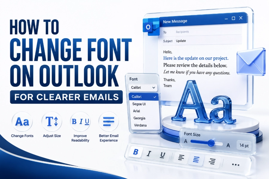
A suitable Outlook font should be easy to read, clean, and appropriate for your message type. Business emails usually work best with simple fonts such as Aptos, Calibri, Arial, Helvetica, Verdana, or Georgia.
Avoid overly decorative fonts for regular email communication. They may look stylish in a design preview, but they can reduce readability and may not display correctly for every recipient, especially across different devices or mail apps.
Your font size matters as much as the typeface. For most emails, 10 to 12 points works well on desktop screens. Larger sizes may suit accessibility needs, while smaller text can look cramped and harder to read.
Practical font selection tips
- Use simple fonts for business and client emails.
- Choose 10 to 12 points for general readability.
- Avoid decorative fonts in professional communication.
- Keep colours simple, preferably black or dark grey.
- Use bold and italic styles only when they support meaning.
- Test your email on mobile before sending important messages.
Changing Font in a Single Outlook Email
Changing the font in one email is useful when you do not want to update your default settings. You can format a specific message for a newsletter, announcement, invitation, or one-off professional communication.
Open a new email in Outlook and type your message. Highlight the text you want to change, then use the formatting toolbar to choose a different font, size, colour, or style for that selected text.
This method only affects the current email. Your future emails will still use the default Outlook font unless you change the default font settings separately through the app’s mail or composing preferences.
Setting a Default Font in Classic Outlook for Windows
Classic Outlook for Windows allows users to set default fonts through the Options menu. This is helpful when you want every new email to use the same font style without adjusting it manually each time.
Open Outlook, choose File, then Options, and select Mail. Under the Compose messages area, choose Stationery and Fonts. From there, you can change fonts for new messages, replies, and forwarded messages.
After selecting your preferred font, size, colour, and style, confirm the changes by choosing OK. The selected font should then apply automatically whenever you create new emails or respond to existing messages.
Changing Font in New Outlook for Windows
New Outlook for Windows has a cleaner interface, and font settings may appear under Settings rather than the traditional File menu. This version is closer to Outlook on the web in layout and behaviour.
Open Settings in Outlook, then look for Mail and Compose and reply. In this area, you can choose the default font used when writing messages, including the font family, size, and basic formatting options.
After saving the setting, start a new email to check the result. If the font does not appear immediately, close and reopen Outlook, then create a fresh message to confirm the updated style.
Classic Outlook and new Outlook comparison
| Outlook Version | Main Font Setting Area | Best For |
| Classic Outlook for Windows | File > Options > Mail | Detailed desktop control |
| New Outlook for Windows | Settings > Mail > Compose and reply | Modern email workflow |
| Outlook on the web | Settings > Mail > Compose and reply | Browser-based email use |
| Outlook for Mac | Outlook > Settings > Fonts or Composing | Mac users and Creative teams |
Changing Font in Outlook on the Web
Outlook on the web lets you change your writing font from the browser. This is useful if you use Outlook through Microsoft 365, Outlook.com, or a work account without opening the desktop app.
Open Outlook in your browser, then choose Settings. Go to Mail and find Compose and reply. In the message format section, select the default font, size, and formatting you want for future emails.
Once saved, your selected font should apply when composing new messages in the browser. Reading font size may still depend on browser zoom, display settings, or accessibility options rather than only Outlook’s writing settings.
Changing Font in Outlook for Mac
Outlook for Mac includes font controls inside the Outlook settings area. The exact menu may vary slightly between older and newer Outlook versions, but the main idea remains the same.
Open Outlook on your Mac, select Outlook from the top menu, then choose Settings. Look for Fonts, Composing, or Reading settings, depending on your Outlook version and the interface currently enabled.
From there, choose the font option for new mail, replies, forwarded messages, or plain text. Set your preferred font and size, close the settings panel, then test the change with a new message.
Customising Fonts for Replies and Forwards
Replies and forwarded messages often appear inside long conversations, so clear formatting is important. Outlook lets you use a separate font style for replies and forwards, which can help your response stand out.
You may choose the same font as new emails for consistency, or select a slightly different colour to separate your response from earlier messages. Keep this subtle so the thread remains easy to follow.
Avoid using bright colours or unusual fonts in replies. While they may draw attention, they can also appear unprofessional. A simple readable font with consistent sizing is usually the safest choice.
Recommended reply formatting
- Use the same font family as new emails.
- Keep the size close to your standard email text.
- Use dark colours for better readability.
- Avoid heavy styling in formal email threads.
- Keep quoted text and new replies visually separate.
- Use formatting only when it improves clarity.
Changing Font Size for Better Readability
Font size directly affects how comfortable your emails are to read. A professional message can still feel difficult if the text is too small, especially on mobile screens or high-resolution displays.
For most Outlook emails, a size between 10 and 12 points is suitable. If your audience includes older readers or accessibility-focused users, a slightly larger size may make the email more comfortable.
You should also consider line spacing and paragraph length. Short paragraphs with moderate font size are easier to scan than dense blocks of text, particularly in business emails, updates, and client communication.
Using Font Colours in Outlook
Font colour can help highlight important details, but it should be used carefully. Black, dark grey, and deep blue are usually safer than bright colours because they maintain readability across screens and themes.
Too many colours can make your email look cluttered or informal. Use colour for emphasis only when needed, such as deadlines, section headings, or short notes that require quick attention from the reader.
Be careful with light colours, especially if the recipient uses dark mode or custom display settings. A colour that looks clear on your screen may become hard to read in another email environment.
Formatting Professional Outlook Emails
Professional Outlook emails should look neat, structured, and consistent. A clean font helps the reader focus on your message rather than the design. Good formatting supports your purpose without distracting from the content.
Use headings, short paragraphs, and careful spacing when sending longer messages. If your email includes instructions, timelines, or project notes, clear typography can make the information much easier to understand.
You can also improve writing style with consistent branding. For example, a business may use the same font in email signatures, proposals, and website content. A helpful related resource is what is a sans serif font.
Managing Font Consistency Across Devices
Emails do not always look identical on every device. A font that appears correctly in Outlook on your computer may look different on a phone, tablet, or another email app.
This happens because some fonts may not be available on the recipient’s device. When that occurs, the email app may replace your chosen font with a fallback font, which can slightly change the appearance.
To avoid problems, choose common system fonts for important communication. Arial, Calibri, Aptos, Georgia, Verdana, and Times New Roman are safer choices because they are widely supported across many devices.
Using Custom Fonts in Outlook
Custom fonts can make emails feel more branded, but they come with limitations. Outlook may let you choose installed fonts, yet recipients may not see the same font unless their device also supports it.
For normal emails, custom fonts are best used with caution. They may work well inside images, banners, or designed email templates, but live email text should remain readable and widely compatible.
If you enjoy experimenting with typography, you can explore a font generator for creative text ideas. For formal emails, however, always prioritise clarity, accessibility, and consistent rendering.
Updating Outlook Email Signature Fonts
Your email signature is part of your professional identity, so its font should match the tone of your emails. A clean signature font makes your name, role, website, and contact details easier to read.
To update the signature font, open Outlook settings and find the Signatures area. Edit the signature text, highlight the content, and choose your preferred font, size, colour, and spacing from the formatting toolbar.
Keep signature formatting simple. Large fonts, many colours, and decorative styles can make signatures look messy. A neat signature should support your message without taking attention away from the email body.
Fixing Outlook Font Changes Not Saving
Sometimes Outlook font changes may not save correctly. This can happen because settings were not confirmed, the app needs restarting, or the account is synced across multiple versions of Outlook.
First, return to the font settings and check whether the selected font is still visible. Save the changes again, close Outlook fully, then reopen it and create a new email to test the result.
If the issue continues, update Outlook and check whether your organisation controls email settings. Some workplace accounts use admin policies that limit stationery, signatures, themes, or default formatting options.
Common font setting issues
- Outlook was not restarted after changes.
- The wrong message type was edited.
- The font is not installed on the device.
- Workplace policies control formatting settings.
- Browser zoom affects reading size on webmail.
- The message is being written in plain text mode.
Using Plain Text and HTML Email Modes
Outlook messages can use different formats, including HTML and plain text. HTML supports font styles, colours, links, images, and layout formatting, which makes it suitable for most modern email communication.
Plain text is simpler and more compatible, but it does not support advanced formatting. If your email is in plain text mode, font styling options may be limited or unavailable while composing the message.
If your font tools seem missing, check the message format. Switching to HTML can restore formatting controls, allowing you to choose fonts, adjust size, add colour, and use other visual styling options.
Accessibility and Email Font Choices
Accessible fonts help more people read your emails comfortably. This includes people with visual difficulties, dyslexia, screen fatigue, or those reading messages on small mobile screens during a busy day.
Use clear fonts, enough contrast, and reasonable sizing. Avoid very thin typefaces, light grey text, and crowded paragraphs. These choices can make emails harder to read, even when the writing itself is clear.
Accessibility also improves professionalism. When your emails are easy to read, recipients can understand instructions faster, respond more accurately, and feel that your communication is organised and considerate.
Best Practices for Outlook Fonts
The best Outlook font setup is simple, consistent, and readable. Choose one main font for everyday communication and avoid changing styles too often. Consistency helps your messages feel organised and professional.
Use bold text for emphasis, not decoration. If everything is bold, nothing stands out. Italics should also be used carefully, especially in long emails where slanted text may reduce readability.
Before sending important emails, review the message on desktop and mobile if possible. Check whether the font size, spacing, links, and signature all look clean. Small adjustments can make the email feel much more polished.
Conclusion
Changing fonts in Outlook is a simple way to improve the look and readability of your emails. You can adjust fonts for single messages, set default styles, customise replies, and update signatures across different Outlook versions.
The best results come from choosing readable fonts, sensible sizes, and consistent formatting. Outlook gives enough flexibility for personal style, but professional emails usually work better when the design stays clean and practical.
Once you how to change font on outlook, you can create emails that look clearer, feel more consistent, and support better communication in everyday personal, business, or team conversations.
FAQ
Can I set one default font for all Outlook emails?
Yes, most Outlook versions let you set a default font for new messages. Some versions also let you set separate fonts for replies and forwards, helping your email style stay consistent across different message types.
Why does my Outlook font look different to recipients?
Your chosen font may not be installed or supported on the recipient’s device. When that happens, their email app may replace it with a fallback font, which can change spacing, appearance, or overall layout.
Can I change font size in Outlook on the web?
Yes, Outlook on the web lets you change the font size for composing emails. However, reading size may depend on your browser zoom, screen settings, or accessibility tools rather than only Outlook’s font settings.
Which font is best for Outlook emails?
Simple fonts such as Aptos, Calibri, Arial, Verdana, Helvetica, and Georgia are good choices. They are readable, professional, and widely supported, making them safer for business emails and regular communication.
Why are Outlook font options missing?
Font options may be missing if the message is in plain text mode, the toolbar is collapsed, or your account has limited formatting permissions. Switching to HTML format often restores the main font controls.