What is a sans serif font is important for anyone working with design, branding, websites, documents, or digital content. A sans serif font is a typeface without the small decorative strokes found at the ends of letters in serif fonts.
The word “sans” means “without,” so sans serif simply means “without serif.” These fonts usually look clean, simple, modern, and easy to read, especially on screens. Their smooth letter shapes make them popular in digital design and everyday communication.
Sans serif fonts are widely used in websites, mobile apps, logos, presentations, social media graphics, and user interfaces. Because they feel direct and uncluttered, they help readers focus on the message without visual distraction or unnecessary decoration.
Meaning of a Sans Serif Font
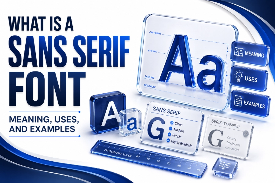
A sans serif font is defined by the absence of serifs, which are the small lines or extensions attached to the ends of letters. Without these strokes, the letters appear cleaner, straighter, and more minimal than traditional serif typefaces.
These fonts often have uniform stroke widths, simple curves, and open spacing. This structure gives sans serif fonts a balanced and modern appearance. They are commonly chosen when designers want text to look clear, friendly, and accessible.
Sans serif fonts can feel professional, casual, bold, or elegant depending on the specific typeface. For example, Helvetica feels neutral and corporate, while Futura feels geometric and modern. This flexibility makes sans serif fonts useful across many industries.
Quick Features of Sans Serif Fonts
- No decorative strokes at the letter ends
- Clean and simple letter shapes
- Strong readability on digital screens
- Modern and minimal visual style
- Suitable for websites, apps, logos, and headings
- Flexible for professional and casual branding
Serif and Sans Serif Font Differences
The main difference between serif and sans serif fonts is the presence or absence of decorative strokes. Serif fonts include small finishing lines at the ends of letters, while sans serif fonts remove those details for a cleaner appearance.
Serif fonts often feel classic, formal, and traditional. They are commonly used in books, newspapers, academic writing, and luxury branding. Sans serif fonts feel more modern, simple, and digital-friendly, making them common in websites and mobile interfaces.
Neither style is automatically better than the other. The right choice depends on the purpose, audience, and design context. Serif fonts can create elegance and authority, while sans serif fonts can create clarity, simplicity, and modern appeal.
History of Sans Serif Typography
Sans serif fonts became more visible in the nineteenth century, especially in posters, signs, and advertisements. Their bold and simple shapes helped messages stand out in public spaces where quick reading was more important than decorative elegance.
During the twentieth century, sans serif typography became strongly connected with modern design. Designers preferred simple forms, clean layouts, and functional communication. Fonts like Helvetica, Univers, and Futura became important parts of modern visual culture.
Today, sans serif fonts dominate digital design because screens need clear and readable letterforms. From smartphones to dashboards, these fonts support fast reading and smooth user experiences across different screen sizes and resolutions.
Serif vs Sans Serif Comparison
| Feature | Serif Font | Sans Serif Font |
| Letter endings | Decorative strokes | No decorative strokes |
| Visual style | Traditional and formal | Clean and modern |
| Common use | Books and print layouts | Websites and apps |
| Reading feel | Classic and detailed | Simple and direct |
| Brand tone | Elegant and established | Modern and approachable |
Main Characteristics of Sans Serif Fonts
Sans serif fonts usually have clean edges, simple shapes, and less decorative detail. This gives them a direct visual personality. Readers can recognise letters quickly because the design avoids extra strokes that may slow down digital reading.
Many sans serif typefaces use consistent stroke widths across each letter. This creates a balanced and organised look. Some styles are geometric, while others are humanist or grotesque, giving designers many choices for different moods and brand identities.
Another key feature is strong spacing and open counters, which are the empty spaces inside letters like “o,” “a,” and “e.” Good spacing improves readability, especially on websites, mobile screens, signs, and small text areas.
Common Types of Sans Serif Fonts
Sans serif fonts are not all the same. They are often grouped into styles such as grotesque, neo-grotesque, geometric, humanist, and rounded. Each style has its own personality, structure, and best-use situation.
Grotesque and neo-grotesque fonts often look neutral, practical, and professional. Helvetica and Arial are common examples. These fonts are useful when a design needs to feel clean, balanced, and easy to understand without strong personality.
Geometric fonts use shapes inspired by circles, squares, and straight lines. Futura and Montserrat are popular examples. Humanist fonts, such as Gill Sans or Open Sans, feel more natural because their shapes are inspired by handwriting and traditional letterforms.
Popular Sans Serif Categories
- Grotesque: practical, early sans serif style
- Neo-grotesque: neutral, clean, and corporate
- Geometric: structured with circle-based forms
- Humanist: natural and readable letter shapes
- Rounded: soft, friendly, and informal appearance
Popular Sans Serif Font Examples
Helvetica is one of the most famous sans serif fonts in the world. It is known for its neutral style, clean structure, and professional tone. Many brands use Helvetica because it feels modern without becoming distracting.
Arial is another widely used sans serif font, especially in office documents and web-safe design. It is similar to Helvetica but more commonly available across devices. Its familiarity makes it a practical choice for everyday digital content.
Other popular sans serif fonts include Futura, Montserrat, Open Sans, Roboto, Lato, Poppins, and Avenir. Each one has a different mood, so choosing the right font depends on whether the design should feel formal, friendly, bold, or creative.
Best Uses for Sans Serif Fonts
Sans serif fonts work extremely well in digital interfaces because they remain clear on screens. Websites, mobile apps, dashboards, online tools, and landing pages often use sans serif typography to improve readability and create a polished user experience.
They are also excellent for headings, buttons, menus, and short blocks of text. Their clean structure helps important words stand out. This is why many SaaS websites, technology brands, and online platforms prefer sans serif fonts.
Sans serif fonts also perform well in logos and branding materials. A clean typeface can make a brand feel modern, confident, and accessible. For more font choices, you can explore a helpful font generator to test styles visually.
Best Places to Use Sans Serif Fonts
- Website headings and body text
- Mobile app interfaces
- Logo and brand identity design
- Social media graphics
- Presentation slides
- Online ads and banners
- Product packaging with modern branding
Sans Serif Fonts in Web Design
Web design relies heavily on readability, speed, and visual clarity. Sans serif fonts support these goals because they display cleanly on different devices. Their simple shapes help users scan content quickly without feeling visually overloaded.
A good sans serif font improves navigation, button labels, forms, and content sections. It helps users understand where to click, what to read, and how to move through a page. This can make a website feel smoother and more professional.
Designers often pair sans serif fonts with strong spacing, clear hierarchy, and readable font sizes. This combination creates better user experience. For web projects, checking a font style preview can help compare different looks before choosing one.
Sans Serif Fonts in Branding
Brands use sans serif fonts when they want to appear modern, simple, and trustworthy. Technology companies, startups, fitness brands, creative agencies, and lifestyle businesses often choose sans serif typography to communicate clarity and innovation.
A sans serif logo can feel clean and memorable because it avoids unnecessary detail. This makes it easier to reproduce across websites, business cards, packaging, mobile apps, and social media profiles without losing visual quality.
However, the chosen font must match the brand personality. A geometric sans serif may feel futuristic, while a rounded sans serif may feel friendly. A neutral sans serif may suit corporate brands that need stability and professionalism.
Branding Benefits of Sans Serif Fonts
- Creates a clean first impression
- Works well across digital platforms
- Supports simple and memorable logos
- Feels modern and accessible
- Helps brands look organised and professional
- Adapts easily to small and large formats
Sans Serif Fonts in Print Design
Although sans serif fonts are often linked with digital design, they also work well in print. Posters, brochures, flyers, business cards, signs, and packaging often use sans serif fonts to create clear and direct communication.
In print design, sans serif fonts are useful for headlines, labels, captions, and short descriptions. Their clean appearance helps important information stand out quickly. This is especially helpful for advertising, where readers often scan messages fast.
For long printed books, serif fonts are still common because many readers associate them with traditional reading. However, modern magazines, reports, catalogues, and brand documents often use sans serif fonts for a cleaner editorial style.
Readability Benefits of Sans Serif Fonts
Sans serif fonts are often considered highly readable on screens because their simple letterforms reduce visual noise. Readers can identify words quickly, especially when the font has good spacing, clear contrast, and balanced letter shapes.
These fonts also support accessibility when used correctly. Large enough font size, proper line height, and strong colour contrast help readers with different visual needs. A good sans serif font can make digital content more comfortable to read.
Readability still depends on font quality, not just font category. Some sans serif fonts are excellent for body text, while others are better for headings. Designers should always test fonts in real content before making final decisions.
Readability Checklist
- Use enough font size for easy reading
- Keep line height comfortable
- Avoid very thin weights for body text
- Maintain strong contrast with the background
- Choose fonts with clear letter shapes
- Test readability on mobile screens
Professional Benefits of Sans Serif Fonts
Sans serif fonts can make content look organised and current. Businesses use them in reports, proposals, websites, and presentations because they create a polished appearance. Their clean style helps information feel structured and easy to understand.
They also work well for brands that want to reduce visual clutter. A simple sans serif typeface allows images, colours, and layout elements to stand out. This supports a more balanced and professional design system.
In professional documents, sans serif fonts like Calibri, Arial, Aptos, and Helvetica are common choices. They are familiar, readable, and widely supported. This makes them safe options for business communication and digital file sharing.
Mistakes When Using Sans Serif Fonts
One common mistake is choosing a sans serif font only because it looks modern. A font must also be readable, suitable for the audience, and consistent with the brand message. Style alone should not guide the decision.
Another mistake is using too many sans serif fonts in one design. Mixing several fonts can create confusion and make the layout feel messy. Most projects look stronger with one main font family and carefully selected weights.
Designers also make errors with spacing, size, and contrast. Even a beautiful sans serif font can look poor if the text is too small, too tight, or placed on a low-contrast background. Typography needs both style and function.
Common Sans Serif Mistakes
- Choosing style over readability
- Using too many fonts together
- Applying very thin text on small screens
- Ignoring mobile readability
- Using poor line spacing
- Choosing a font that does not match the brand
Choosing the Right Sans Serif Font
Choosing the right sans serif font starts with understanding the purpose of the design. A website, logo, resume, app, and poster may all need different typefaces. The font should support the message rather than compete with it.
Think about the personality you want to create. A corporate brand may need a neutral sans serif, while a creative brand may need something more expressive. A children’s brand may benefit from rounded and softer letterforms.
Always test the font in real use before finalising it. Check headings, body text, buttons, mobile view, and different font weights. A font may look good in a sample but perform poorly in a complete design layout.
Best Font Pairings with Sans Serif Fonts
Sans serif fonts can be paired with other sans serif fonts or with serif fonts. A common approach is using a bold sans serif for headings and a clean sans serif for body text. This keeps the design simple and consistent.
Another popular pairing is a serif heading with sans serif body text. This creates contrast between classic and modern styles. It can work well for blogs, editorial websites, portfolios, and brands that want both elegance and clarity.
Good pairing depends on contrast and harmony. Fonts should be different enough to create hierarchy but similar enough to feel connected. Avoid pairing fonts that fight for attention or create an uneven reading experience.
Simple Font Pairing Ideas
- Montserrat for headings with Open Sans for body text
- Playfair Display headings with Lato body text
- Poppins headings with Roboto body text
- Helvetica headings with Georgia body text
- Futura headings with Source Sans body text
Sans Serif Fonts for Websites
For websites, sans serif fonts should be readable, lightweight, and responsive. Popular web fonts include Roboto, Open Sans, Lato, Inter, Poppins, and Montserrat. These fonts are widely used because they display well across modern screens.
A website font must support both design and performance. Heavy font files can slow down page loading, so it is wise to use only the needed weights. This keeps the site faster and improves the user experience.
Mobile readability is especially important. A font that looks elegant on desktop may feel cramped on a small screen. Designers should test font size, spacing, and contrast across phones, tablets, and large monitors.
Sans Serif Fonts for Logos
Sans serif fonts are excellent for logos because they often look clean and timeless. Their simple structure makes them easy to recognise at different sizes. This matters because logos appear on websites, icons, signs, and printed materials.
A logo font should be distinctive but not confusing. Some brands customise sans serif letters to create a unique identity. Small changes to spacing, curves, or letter shapes can make a simple typeface feel more original.
When choosing a sans serif font for a logo, consider long-term use. Trendy fonts can become outdated quickly. A balanced and flexible sans serif typeface can help a brand stay visually relevant for many years.
Logo Font Selection Tips
- Choose a font that matches brand personality
- Check readability at small sizes
- Avoid overly trendy letter shapes
- Test the logo in black and white
- Review spacing between letters
- Make sure it works across digital and print formats
Modern Sans Serif Font Trends
Modern sans serif font trends focus on clean shapes, flexible weights, and strong screen performance. Many brands now use variable fonts because they offer multiple weights and styles within one file, improving both design flexibility and loading efficiency.
Geometric sans serif fonts remain popular because they feel structured and futuristic. They work well for technology, finance, architecture, and SaaS brands. Their precise forms create a sense of order, confidence, and modern thinking.
Humanist sans serif fonts are also growing in popularity because they feel warmer and more natural. They are useful for brands that want clarity without feeling cold. This balance makes them suitable for healthcare, education, and service-based websites.
Conclusion
Sans serif fonts are clean, modern, and highly useful in both digital and print design. They remove decorative strokes to create simple letterforms that support readability, branding, and smooth user experiences across many platforms and content types.
From websites and apps to logos and presentations, sans serif fonts help messages look clear and professional. Their flexibility makes them suitable for corporate, creative, casual, and technology-focused designs when chosen with care.
What is a sans serif font helps you make smarter typography decisions. The best font is not only attractive but also readable, purposeful, and aligned with the message your design needs to communicate.